Thursday 30 October 2014

Art Lending Library on tour

Today I took part in the launch of the Art Lending Library in Peterlee, East Durham.


The Art Lending Library is a project by 
Market Gallery and Walker & Bromwich.


The ambitious commission by Zoƫ Walker and Neil Bromwich takes the form of an experimental library and public procession. Originally conceived and curated by Market Gallery for Glasgow International Festival of Visual Art 2012, it provides the unique opportunity for the people of the town or city in which it is exhibited to borrow works of art and enjoy them within their homes, work places and community centres.

The Art Lending Library brings together over 50 works by a diverse range of artists working across the broad spectrum of formats available within contemporary visual arts practice. The project has been made possible through the generosity of participating artists in gifting their works into the care of the library, to be made available to loan for the duration of the exhibition.


The library structure is made up of multi-functional wooden crates. Each crate houses an artwork and is detachable and ready for transport to people's homes. On returning to the library the crate is re-attached to the body of the library and again operates as a display case. This modular design creates a constantly changing sculptural form that maps the user's borrowing. As people borrow or return an artwork they will also physically shape the library, becoming a part of an on going social sculpture.

The project stands in resistance to the tide of narrowing access to the arts and education by creating an egalitarian space where art can be borrowed and enjoyed by all sectors of society. Art Lending Library follows the model of a public lending library which members of the public can join free of charge.


Following its success in Glasgow, the Art Lending Library is going on tour, and today it was launched in as part of the inaugural East Durham Creates Festival. Here are the details:

Peterlee
Peterlee Memorial Methodist Church 29 Oct – 1 Nov 2014

Thornley
Thornley Village Centre 7 – 10 Nov 2014

South Hetton
Robin Todd Centre, South Hetton 13 – 16 Nov 2014

Artworks from artists based in Durham have been chosen for the Art Lending Library in this venue.

Artists that have been exhibited in Art Lending Library include Penkiln Burn, Graham Fagen, Joanne Tatham and Tom O'Sullivan, Mark Vernon, Ellie Harrison, Katie Cuddon, Henna Rikka Halonen, Oliver Braid, Elpida Hadzi-Vasileva, Mark McGowan, Karen Guthrie and Nina Pope, James McLardy, Stephen Hurrel, Alec Finlay, Laura Eldret, Calum Stirling, Andrew Burton, Laura Aldridge, David Sherry, Chris Biddlecombe, Stuart Murray, David Faithfull, Yu-Chen Wang, Jonathan Owen, Nick Fox, Andros Semieko, Kate V Robertson, Peter Evans, Beagles and Ramsay, Jemima Brown, Ally Wallace, Dean Hughes, Fernando Arias, Salome Oggenfuss, Roos Dijkhuizen, Kevin Hunt, Clara Ursitti, Tessa Lynch, Helen De Main, Sandy Grant, Jasmina Cibic, Pilvi Takala, Razan Akermay, Rachel Maclean, Pester & Rossi, James Stephen Wright, Romany Dear, Jacqueline Donachie and Roddy Buchanan, Tim Savage, Ciara Phillips, Catrin Jeans, Chris Mackenzie, Ross Frew, Ewan Manson, Rachel Barron, Sarah Laing, John Vella, Tom Nolan, Kate Murphy, Deborah Kelly, Michael Needham, Ashley McCormick, Annie O'Donnell, Dryden Goodwin, Gayle Chong Kwan, Iacopo Seri, Juan Pablo Echeverri, Margaret Harrison, Nick Kennedy, Nicky Peacock, Kraig Wilson

Designers Sophie Dyer & Sebastian Gorton Kalvik continue to deliver the design work for Art Lending Library.

The project is accompanied by a programme of free participatory events that are open to everyone.


Being involved in the parade was a really positive, fun and moving experience. A group of students from the Fine Art department at Newcastle University volunteered, and we were kitted out with librarian and art-handler outfits. The procession took us from the Methodist Church where the library is based, along the High Street and through the local shopping centre, leading back to the church.


Some of us were carrying flags, there was an art handler carrying an artwork which was then handed over to a librarian, other librarians were using the crates as drums, and we were handing out the Art Lending Library cards. An excellent brass band brought up the rear of the parade and added a crucial tuneful element to the memorable event.


Having seen the Art Lending Library in Glasgow, back in 2012, I was very keen to be involved in it here, and the experience truly enhanced my appreciation of this wonderful participatory artwork.

Walking down the grim, grey High Street lined by shops to let, value shops and bookies could have been a rather depressing experience, but the Art Lending Library brought a cheer to the streets and it was amazing to witness the light that people had in their eyes when we passed.

I gave a couple of lads some library cards, and a moment later they were helping hand out a bundle of these cards to others as they walked with us to the church.

Already there have been 4 items loaned out of the library, hopefully a sign of things to come.

At the briefing we were given some rather startling figures about the lack of arts and culture provision in this area, and I really hope that having such high quality artwork in Peterlee gives the community a sense of what contemporary art is and can be, and helps create a curiosity and desire for more.

For more information please visit
http://www.artlendinglibrary.org.uk/about/east-durham/

Visiting Artist Lecture - Stephen Hurrell

This week's Visiting Artists Lecture was given by Glasgow-based artist, Stephen Hurrel.


Tuesday 28 October 2014

Erratic Landscapes by Matthew Smith at Vane

For his second solo exhibition at Vane, Matthew Smith has conceived a multi-layered landscape of works, a hybrid of the manmade and natural environment that examines the intersections between these two polarities.


The series of Corporate Landscape drawings, shown here together for the first time, are made up of various actual corporate logos that depict snow-capped mountains. These images are regularly deployed in advertising to connote ruggedness, nature and immovable permanence, in order to sell us all manner of products from financial services to chocolate. The drawings link together individual logos to create a graphic mountain range, a horizon line, a synthetic topography that rises and falls creating its own peaks, valleys and ravines. Reminiscent of a graph plotting the financial progress of a business or the stock market, they become a metaphor of the corporate world.


The ‘Erratic Landscape’ sculptures are placed as if randomly scattered throughout the gallery, a series of boulder-like objects constructed from bits and pieces of chipboard. The faceted forms created are reminiscent of the abstracted rock shapes that might be seen in one’s peripheral vision in a computer game. A rough, pixilated abstraction, convenient shorthand to denote terrain, they never pretend to be anything but abstracted approximations, hollow copies. Each surface of the sculptures is a different shade of grey, thus the forms are not easily resolved from a single viewpoint; the viewer pieces them together by moving around them. In geology ‘erratic’ is a term for a stone transported by a glacier and deposited far from its point of origin: an object profoundly out of place. In a similar way these erratic forms are deposited within the space of the gallery, a counterfeit sculptural landscape for the viewer to negotiate.


In the series of Cloud drawings Smith again uses corporate logos, this time depicting cartoon-like fluffy clouds. These logos represent various companies – mainly in the field of computer technology – mostly offering to store information in ‘clouds’. Through the simple use of the word ‘cloud’ in conjunction with the image, we are encouraged to think of our information and documents as ethereal, not having any physical presence. However, this information is physically supported on servers housed in large warehouses consuming enormous amounts of energy to the detriment of the environment.


Made using hundreds of different cloud logos that are repeatedly traced in graphite, the faint lines overlapping and gradually building up a looming cloud of information, Smith’s drawings are not immediately recognisable as simple archetypal trademark images. This makes the finished drawings much more akin to a real cloud: an amorphous form in a constant state of flux.


Smith carefully layers together these bodies of work, immersing the viewer in a landscape of representation, a terrain to be negotiated both physically and conceptually.

http://vane.org.uk/erratic-landscapes

Lithography workshop

Today I had an introduction to aluminium lithography, a new process for me.

"Lithography
planographic printing process that makes use of the immiscibility of grease and water.

In the lithographic process, ink is applied to a grease-treated image on the flat printing surface; nonimage (blank) areas, which hold moisture, repel the lithographic ink. This inked surface is then printed—either directly on paper, by means of a special press (as in most fine-art printmaking), or onto a rubber cylinder (as in commercial printing)."

http://www.britannica.com/EBchecked/topic/343748/lithography

I applied pencil crayons, marker pens, cut up pieces of card and cut up pieces of tracing paper onto a shape that I had torn from tracing paper.


Lithography plate prior to inking or printing

I then exposed this imagery onto the aluminium plate, and printed the plate using the offset press.


Lithography plate after inking


My first lithographs


Monday 27 October 2014

New casts revealed

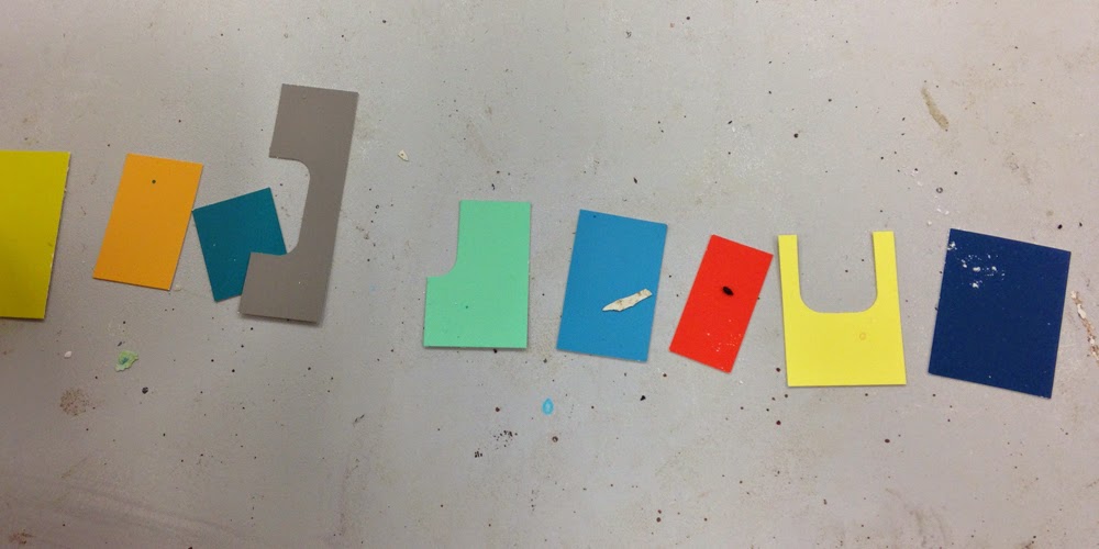
I set out to make a number of new rectangular casts that I will then experiment with in terms of how to display them.


Sunday 26 October 2014

A Bad Hand, Folding: A Live Rehearsal

A Bad Hand, Folding: A Live Rehearsal

Featuring versions by:
Faye Green & Beth Ramsay
Giles Bailey
Paul Becker & Francesco Pedraglio

Music by Dawn Bothwell.


Last night I went to the Culture Lab for A Bad Hand, Folding: A Live Rehearsal. I did not know what to expect, and the event was like nothing else I have ever experienced.

It was like sitting in on a practice session as the group tested out different ideas, sometimes stopping in the middle of some spoken word, other times waiting until the end of a section in order to have a chat about what was working/not working.

It made me question the role of the audience. We were not acknowledged, except at the start when they explained that this was not something that they had finished, and therefore that we should be patient with them. Were we there to give them an idea of what it would be like to have an audience? At times I wondered whether some of the performers were off-put by having an audience there, and them having to critique their own performance.

It was really interesting to spectate, what seemed to me to be a kind of critique session for a spoken word performance. As this is not my area of practice, I learned a lot about what they thought was not working within the performance, and different ways they could change and approach their work.

It would be fascinating to see the final outcome, and see how far it has moved on since the rehearsal.

Friday 24 October 2014

Torsten Lauschmann Artist Talk


This week's visiting artist was Torsten Lauschmann, and I was one of the students who was chairing the seminar that took place after the talk.

Here are some of my thoughts in relation to / as a result of looking at Torsten's work

- Lauschmann often exhibits a work that he thinks is unfinished, and will reshow the work in different exhibitions, sometimes it getting closer to being finished. An exhibition is an opportunity to develop the work and each exhibition marks a different stage in its development.

- His work has been described as "too fast to be photography, too slow to be film"

- Lauschmann thinks that interactive art seems too much like a game

- Interested in failure

"I didn't fail, I just found out how it doesn't work"

Having heard Lauschmann explain the setup of certain works within his artist talk, I began to question how well his website represents his work. For example, on his website, 'Dead man's switch' is a video of a candle. However, when discussed in the artist talk, Lauschmann explained that every time the candle in the video was blown out, the lights in the gallery would come on, thus illuminating the audience and surroundings. In this way, the physical space plays its part in the artwork, yet online, one would not understand how it is actually exhibited. It brought into question the nature of how to document certain works.

Likewise, some artworks work well on the computer screen, but other works may not suit this - how does an artist frame the artwork and the documentation?

For more information about Torsten Lauschmann, visit

Casting time!

I've spent the past couple of days in the casting workshop, making some more layered-coloured plaster blocks which I then want to experiment installing so as the audience can walk around rather than looking at from a single side.

I've already used over 35kg of plaster in this 2 day period! Oh, it is good to be casting again.

This is the kind of colour scheme I have been adopting.

\\


Wednesday 22 October 2014

Friday 17 October 2014

Screenprinting induction

This morning we had our introduction to screen printing and then were let loose ourselves this afternoon! 

Given the short amount of time we had to prepare imagery for the screen, I made a simple drawing using cut out bits of card, drawn lines with marker pen and areas of pastel onto the acetate.

We then exposed the screen and when checking the screen after exposure, I could then see that the drawn marker pen lines and pastel areas would not be printed well as they obviously did not block enough of the light when the screen was being exposed. 

This is the result:


The areas where the card cut out were placed have printed as solid black shapes, but the other drawn marks did not print well.


I then printed the image again to see how it would change when printed onto an already patterned surface (this was a screen print blend that I had done about a year ago).


I also produced another quick image using the cut out pieces of card, and this time used a screen that did not have emulsion on. I stuck the card pieces onto the surface of the screen using making tape. In theory, the areas around the cut out card areas should be printed.


However, the result was not as I expected as the ink did not go into all the areas in between the pieces of card and so I got a very rough print.

When printed onto the gridded paper (another screen print that I had done years before), the image reminded me of an architects plan drawing of an interior.


I was disappointed that the imagery had not printed as I had intended, and liked the look of the screen once I had printed (as above), so I removed all of the cut out pieces of card, and then printed onto the paper to get the following result:


Wednesday 15 October 2014

Basic Design: A Revolution in Art Education at The Hatton Gallery

I attended a fascinating talk by Dr Beth Williamson and Elena Crippa in conjunction with the current exhibition at the Hatton Gallery, Basic Design: A Revolution in Art Education.

The exhibition "explores the role that Basic Design - a new radical approach to training in arts schools - played in revolutionising art education across Britain opens at the Hatton Gallery this September.

With a particular focus on Newcastle in the 1950s and 60s, through the work if some of its key teachers including Richard Hamilton, Victor Pasmore and their students, the display will survey the main features of Basic Design as they emerged and were taught in Britain, with accompanying archive material and video documentation.

Julie Milne, chief curator of art galleries at Tyne & Wear Archives & Museums, said:

“Basic Design was a significant turning point in the history of British art education. This new method of teaching art was showcased through ‘The Developing Process’ exhibition, which was held 1959 at the Hatton Gallery, and afterwards shown at the ICA in London.

It was pioneered by Victor Pasmore and Richard Hamilton and, both of whom taught at Newcastle University. It is therefore fitting to display Basic Design at the Hatton Gallery, highlighting their dedication to teaching and their association with the North East.”

Basic Design: A Revolution in Art Education is part of major new research programme, supported by the John Ellerman Foundation's Regional Museums and Galleries Fund, which will explore the impact and legacy of Basic Design in Newcastle. The project will build on research initiated by Tate in 2013, and focus on unique archive material held by the Hatton Gallery and Newcastle University's Fine Art School which is currently under-researched and largely inaccessible.

The project will shed light on the important historic role of what was the ground-breaking art school of the period and the working practices of two major 20th century British artists: Pasmore and Hamilton. It will also explore the relevance of Basic Design in contemporary art education and open up the debate about the role of art teaching, which some would argue is being devalued in the current national curriculum, and a key threat to the future support and development for arts and culture in the UK.

Nicola Pollock, Director, John Ellerman Foundation said

“We are delighted to be supporting Basic Design. The project involves essential research into a unique, nationally significant archive, and is likely to appeal to a diverse range of audiences, from artists and curators to educators and the wider public.”

Pasmore and Hamilton played a pivotal role in the development and integration of Basic Design as a teaching method, which received establishment approval through the Coldstream Report (1960), and was to influence higher art education for generations to come.

Three themes were common to Basic Design teaching: Intuition, Science and Technology. Established methods of teaching art focused on copying and drawing from life, whereas Basic Design taught the core skills which underpinned all art and design activities, through the use and exploration of various techniques.

During his time as head of painting (1954-61) at King’s College (now part of Newcastle University), Victor Pasmore drew on the thinking of Paul Klee, the famous Bauhaus artist and teacher. Pasmore encouraged his students to actively engage in the processes of nature rather than remain an outside observer.

Richard Hamilton, taught in Newcastle until 1966, he was key in the development of Basic Design and encouraged his students to think of their work in terms of diagrams of thought processes rather than self-expression, using logic and rationale to reach a conclusion.

Basic Design: A Revolution in Art Education also features work by Alan Davie, Terry Frost, Eduardo Paolozzi, Rita Donagh and Richard Smith. The exhibition is on show at the Hatton Gallery from 19 September - 13 December 2014. In partnership with Tate Britain. Supported by John Ellerman Foundation."

http://www.twmuseums.org.uk/hatton-gallery/latest/news/basic-design-a-revolution-in-art-education.html

Tuesday 14 October 2014

Trip to Cragside

Our first official MFA outing was to Cragside, a National Trust property and estate in the North East.

"Cragside was created very largely by three remarkable Victorians - its owners, William and Margaret Armstrong, and their architect, Richard Norman Shaw. Despite later changes, the house and estate still bear their distinctive stamp.

Sir William, later 1st Lord Armstrong (1810-1900) had one of the most extraordinary careers of the Victorian era.

In 1863, not having taken a holiday for years and tired after organising a conference of the British Association, Armstrong visited Rothbury. He had happy childhood memories of the area, and decided to build a place in the country.

And so Cragside began."

http://www.nationaltrust.org.uk/cragside/history/


"Lord Armstrong was an engineer through and through and he brought his wealth of professional experience as a great civil and mechanical engineer to brilliant effect at Cragside. He knew how to move water about after working on a project to bring fresh drinking water to Newcastle.

Building and civil engineering wasn’t a problem; he had seen his factory built and knew all about bridge construction. Mechanical engineering was his meat and drink at his Elswick Works on the Tyne. He was 53 when he started Cragside and knew his stuff, and if he didn’t know something, he certainly knew someone who did.

His technical and scientific mind made Cragside a wonder of its age and provided incomparable luxuries. Imagine the task of installing an infrastructure of pipes and a hydraulic engine that pumped thousands of gallons of fresh water to the House enabling:
Hot running water
Cold running water
A Turkish bath suite
A hot room
A rain shower
A plunge bath

The meat in front of the kitchen range was turned by a little ‘Scotch Mill’ water turbine, still in operation today. A hydraulic passenger lift was based on the ‘jigger’ technology he had developed for his world famous cranes. Ranks of cast iron pipes and radiators provided central heating, and, just to make everything safe, a fire hydrant ring main surrounded the house.

Water was to give Cragside its ‘world’s first’ status when he developed hydroelectricity here in 1878. Then, in 1880, the house had one of the first proper installations of his friend Joseph Swan’s light bulbs. A bright, clean form of lighting was introduced into domestic use, making Cragside the first house in the world to be lit by hydroelectricity."

http://www.nationaltrust.org.uk/cragside/history/view-page/item909687/

"The recently operational Archimedes screw will produce about 12kw of electricity and over the course of a year Cragside expects the screw to provide about 10% of its electricity. This is the equivalent to lighting all the lights in the house for a year, but not enough to run all its computers, fridges and freezers etc. "

http://www.nationaltrust.org.uk/cragside/visitor-information/article-1355850558148/


We were able to look round the house, and view what remains of the Armstrong's collection. His enthusiasm for collecting included contemporary British art, furniture, ceramics and natural history. The house also has items which reflect his scientific curiosity and experimentation.


This year the team at Cragside have worked with arts & heritage to create a contemporary art exhibition that responds to this unique place focusing on Armstrong’s fascination with light.


LUX showcases six artists work.


Imogen Cloƫt Illumine

Imogen has created an immersive installation in the historic interior of the dining room. At the centre of the room a large Victorian ‘boardroom’ table, its surface covered with industrial polished steel, reminds us of Armstrong’s industrial might. Suspended light bulbs directly reference the invention of Joseph Swan’s incandescent bulb and the first stage of their installation within the house, signalling the birth of modern domestic lighting.


Ive been told that although Armstrong owned many collected objects, these were collections that he kept in order to appear an interesting person rather than because he actually had an interest in collecting.


I was attracted to the pianola as it reminded me of my Gran as she has one in her bungalow, and as kids we often used to play it, pretending that we were pianists!

It would be good to create an artwork that could be played on the pianola - both visually and musically stimulating. Perhaps using the laser cutter?


Andrew Burton Light Vessel


Andrew has created a sculpture made up of thousands of small glass bricks using the sun as the source of light.


The work draws its inspiration from the title of the project, LUX, from Armstrong’s fascination with light and from the sense of excitement and innovation that Joseph Swan’s early incandescent lamps used at Cragside would have generated when they were first seen.


Jem Finer Spiegelei Junior III

Spiegelei Junior III is a sculptural camera obscura. Visitors are invited to place their head inside the sphere to gain the full effect of the work. Reflecting and inverting the visible world around it you will see a 360 degree panoramic projection of the space.
This work was originally commissioned by the Queen Elizabeth Olympic Park.