Monday, 31 March 2014
Guide to Glasgow International
A weekend in Glasgow, at Glasgow International
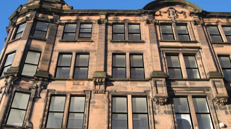
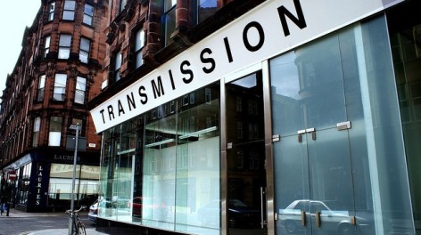
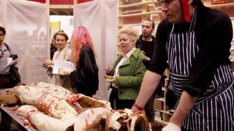
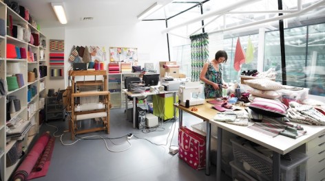
Transmission Gallery (courtesy Merchant City Marketing); artist Angharad Mclaren & South Block (both courtesy South Block); Bedwyr Williams and Transmisson cafe (both courtesy Transmission)
Glasgow has long had the edge when it comes to contemporary art. Our guide to its biennial festival, and the places to eat, drink and shop en route, ensures you make the most of both the art and the city.
The Glasgow International map features 53 separate sites, dotted around the city centre’s regimented street grid and edging out in all directions to the more unruly suburbs. This biennial festival of contemporary art infiltrates the city’s existing (and extensive) art infrastructure and adds a wealth of new, temporary venues and public sites for its 18 days.
Now in its sixth edition – and the first under new director Sarah McCrory – Glasgow International is both in and of the city. Shows by visiting international artists rub shoulders with exhibitions from equally well-travelled locals, and the sense of the city’s healthy cultural confidence is palpable.
For your visit to GI, start on Osborne Street at the Festival Hub in South Block, home to artists studios, creative businesses and All That Is Coffee – an artisan espresso outlet that also knows its way around a good cup of tea and a chai latte. Here you’ll find yourself within striking distance of some of Glasgow’s best independent bars, cafes and – of course – gallery spaces. A short walk up Osborne Street there’s The Modern Institute, for example, a commercial gallery with a 40-strong roster of artists that includes four Turner Prize winners. For GI, the gallery is hosting group show, Life & The Invitation& Vapour in Debri&.The Modern Institute’s other space nearby on Aird’s Lane is showing New York-based artist Anne Collier.
The singer looks much as he did in the 1980s. Must be the healthy Glasgow lifestyle.
While you’re in this part of town, you should also visit the artist-run Transmission Gallery on King Street – showing Puerto Rico’s Beatriz Santiago Muñoz – and its neighbours Street Level Photoworks (Latvian artist Arnis Balcus and the Netherlands’ Johan Nieuwenhuize) and Glasgow Print Studio (Glasgow artist Alex Frost). The Print Studio has an easy to browse shop with a fantastic collection of new and archive prints by Scottish and international artists.
Ready for a break? Get yourself to Once Upon A Tart on the opposite side of the street, a kitchen and bakery where you can indulge in home-baked treats of the sweet or savoury kind. If it’s alcohol you’re after, then try Mono, a bar and gig venue that serves vegan food and – curiously and brilliantly – has a record shop attached to it, run by the singer in legendary Glasgow indie band The Pastels. He’ll most likely be behind the counter, sifting through vinyl and looking pretty much as he did in the 1980s. Must be the healthy Glasgow lifestyle.
Where now? Further east, perhaps, to Charlotte Street where Hardeep Pandhal presents Jojoboys, a series of lamppost banners that explore the history and visual identity of Camp Coffee. (The factory that first made this coffee substitute, originally created in 1885 for Scottish soldiers in India, once stood on the street.) There’s more to see in the East End, such as the David Dale Gallery (showing Swiss artist Claudia Comte), but the other main cluster of GI activity is to the west of the city centre on Sauchiehall Street. Head on foot along Argyle Street, turn right onto Queen Street, and be sure to stop off on your way at GoMA (Gallery of Modern Art). Housed in a neo-Classical building built in 1778, it is showing the first major UK solo exhibition by Berlin-based Alexsandra Domanovic, as well as work by Modern Institute artist Sue Tompkins.
Now continue west towards Buchanan Street, where Glasgow comes to shop for shoes, clothes and all things Apple. If you’re in need of (more) good coffee, check out local chain Tinderbox, either in the upmarketPrincess Square shopping centre or back east along Ingram Street, described by Glasgow’s marketers as “the city’s most exclusive fashion boulevard”. Which means Jigsaw, Ralph Lauren, Mulberry and a nearby Armani store.
At the top of Buchanan Street, turn left onto Sauchiehall Street by the Royal Concert Hall. A short walk will take you to McLellan Galleries, which has been brought out of its slumber for GI. Built in 1856 and now rarely used, it is hosting video work from Jordan Wolfson, paintings by Avery Singer, sculptural and audio-visual installations from Glasgow-based Charlotte Prodger, and a retrospective of Hudinilson Jr, the Sao Paulo-based artist who died earlier this year.
There’s another retrospective – this time of Palestinian artist Khaled Hourani – at the nearby Centre for Contemporary Arts (CCA), as well as work by the four artists shortlisted for the Jerwood/Film and Video Umbrella Awards. With its airy indoor courtyard café, performance spaces and the Welcome Home craft and design store, CCA is a good place to linger. It’s got a great bookshop, too.
To the rear of CCA, you’ll find the Charles Rennie Mackintosh-designed Glasgow School of Art (showing Michael Stumpf’s wittily-observed sculptures), and opposite it you can’t miss the brand new Reid Building, clad in frosted glass panels and glancing knowingly at Mackintosh’s 1909 masterpiece.
There’s more to take in heading west, from Simon Martin at the Kelvingrove Art Gallery and Museum to the foodie delights of the bars and restaurants on the Finnieston stretch of Argyle Street – tryCrabshakk, where super-fresh seafood is handled with care, served with understated style and has even won the praise of Observer food critic, Jay Rayner.
Jump in a car or taxi now and head to the South Side – over the Clyde toTramway on Albert Drive, which is showing three decades of work by American video and performance artist Michael Smith, along with a new commission from Welsh artist Bedwyr Williams. Further south, the disused Govanhill Baths features inflatable sculptures by Anthea Hamilton and Nicholas Byrne, and there’s more work on show at the artist-run Queens Park Railway Club. And with a name like that, how can you resist paying a visit?
Glasgow International is nearly here - time to get planning!
Glasgow International 2014: Inflatable art, nail bars & dystopian visions in Scotland’s creative capital
Centre for Contemporary Arts (CCA), Glasgow, Scotland, 4 April 2014–21 April 2014
Posted by Susie Stubbs 25 March 2014
http://www.creativetourist.com/articles/art/scotland/glasgow-international-2014-inflatable-art-nail-bars-dystopian-visions-in-scotlands-creative-capital/
Bedwyr Williams, ‘The Starry Messenger' (still), 2013. Courtesy the artist, MOSTYN, Oriel Davies & Arts Council of Wales
As Glasgow gears up for its biennial festival of visual art, we publish aguide to the city, and an overview of a festival considered by some to be the best in Britain.
Glasgow International may be one of the world’s younger visual art festivals, but in the years since this particular biennial baby launched in 2005, it has secured the attentions of critics, artists and the culturally minded from across the globe. The Guardian’s notoriously hard to please Adrian Searle reckons it’s the country’s best such fest; critic Laura Cummings praised it for its “openness, involvement and honest directness”.
One of the reasons Glasgow International has risen through the ranks so quickly is that it hasn’t been conjured out of thin air. Like Liverpool Biennial, it’s based on a homegrown and artist-led arts scene, one that just happens to have international credibility. And while it doesn’t hurt that GI is held in one of the most interesting cities in Europe, another reason it works is thanks to its efforts to push the boundaries of what is commonly considered “visual art”. So, the last event saw a focus on live and immersive artworks – Jeremy Deller’s Sacrilege, a bouncy castle version of Stonehenge, for example, or artists at the Mitchell Library masquerading as librarians – and it also saw a spike in the numbers of giddy, bouncing-up-and-down art lovers who attended.
It doesn’t hurt that GI is held in one of the most interesting cities in Europe
The focus this year is no different. Although the 18 day festival is headed up by a new director (Sarah McCrory, formerly of Frieze Projects), and although it takes over all of the city’s mainstream museums and galleries, the trend for immersive, innovative art continues. Bedwyr Williams creates a dark and disturbing installation at Tramway, a life-size vision of a world corrupted by greed and status symbols, Alistair Frost runs a nail bar from a disused shop unit, and a group exhibition atSWG3 Gallery sees artworks tumble from the frames that normally constrict them.
Anthea Hamilton and Nicholas Byrne, meanwhile, bring back the inflatable art, this time via a series of pin-shy sculptures that fill a disused, historic swimming baths, and Play Summit, led by artist Nils Norman, relocates an adventure playground to Glasgow Green, with a series of parallel talks and demos lined up to tackle the issue of child’s play (areas) in cities.
With fifty exhibitions, there is much at this year’s Glasgow International to get to grips with, in a city that we have long turned our envious eyes towards – which is why we have published a guide to both the festival and the city it calls home. Written by the Glasgow-based art writer, Chris Sharratt, it provides a handy route around the events that make up Glasgow International, with recommendations of places to eat, drink and shop along the way. And with all artistic eyes about to turn on Glasgow, and with Easter’s Bank Holidays looming large, now is the time to book a trip.
Thursday, 27 March 2014
What Makes an Artist an Artist?
by Jillian Steinhauer on March 20, 2014
The question of who, exactly, is an artist — what that word means, who defines herself by it — has always been a tricky one. All sorts of surveys purport to the tell us the number of artists in the US, from the government census to independent initiatives, but the terms of the discussion have never been entirely clear. Are artists self-defined? Must they make money off their creative work (a certain amount)? What kinds of creative work count? Can you be a professional artist if you spend 30 hours a week doing something besides making art?
Each survey defines “artist” in its own way and then moves on with its results, but a new study in the journal Poetics takes up the root question itself: “Who is an artist? New data for an old question,” by sociologists Jennifer C. Lena and Danielle J. Lindemann. Lena and Lindemann look at data collected in the 2010 Strategic National Arts Alumni Project surveyas a means of exploring the confusion over who or what constitutes an artist. As they write in their abstract:
In this study, we explore the ‘‘professional artist’’ as the outcome of an identity process, rendering it the dependent rather than the independent variable. In their responses to the 2010 Strategic National Arts Alumni Project survey (N=13,581)—to our knowledge, the largest survey ever undertaken of individuals who have pursued arts degrees in the United States—substantial numbers of respondents gave seemingly contradictory answers to questions asking about their artistic labor. These individuals indicated that they simultaneously had been and had never beenprofessional artists, placing them in what we have termed the ‘‘dissonance group.’’ An examination of these responses reveals meaningful differences and patterns in the interpretation of this social category.
Specifically, Lena and Lindemann home in on a group of 3,816 respondents to the SNAAP survey who said they had worked in the arts but never been professional artists. Now, of course, there are plenty of arts jobs that don’t involve the actual production of art, yet the pair identified many writers, architects, musicians, photographers, and more — that is, people who create artistic products — that fell into this group. “Clearly, for many respondents, there is a disjuncture between ‘work as a professional artist’ and ‘work in [artistic occupation],’” the pair write. Why?
They go on to examine various possible answers: the SNAAP survey specifically states that teachers do not qualify as artists, a distinction to which a number of respondents object; designers constitute a fuzzy “boundary group,” with some of them identifying as artists and others not; people have faulty memories. But Lena and Lindemann’s strongest contender, and the one on which they put their money, is the idea of embeddedness and cultural capital — that people who grow up with artist parents or relatives, attend specific arts schools (rather than just programs), and work mostly in arts-related jobs feel more comfortable identifying as professional artists. “There is something that arts graduates get in their lives, through their connections with other artistic individuals, that contributes to the salience of their ‘artist’ identities,” Lena and Lindemann write. They continue:
We hypothesize that highly embedded art world members experience less ambiguity around their identity as artists, while those who only entered art-centered environments in their graduate training years experience more difficulty identifying as professional artists. Seeing one’s self as a professional artist is an achievement that compares to entering other elite status groups, in that advantages accrue to those with the implicit and explicit knowledge of group conventions, attitudes, habits, and ways of being and can remain beyond the reach of even those who are trained to belong.
Lena and Lindemann readily acknowledge that there’s lots more research to be done and that their conclusion is far from absolute — some people purposefully choose not to be embedded, for instance, and although the paper doesn’t mention this, it seems plausible to me that some people may associate the term “artist” specifically with visual art. But the sociologists are right in pointing out that if organizations want to target artists, and if governments want to use research data to shape policies geared towards them (both of which are already happening), it might help to first figure out who an artist is.
Sunday, 23 March 2014
The Mission - Art and design for curious minds
I ended my day trip to Edinburgh with a visit to The Mission, a relatively new contemporary art space in Edinburgh.
"The Mission Art + Design Gallery specialises in affordable artwork from independent artists. We sell fine art canvases, art prints, unique design gifts, art books, stationery, design-centered children’s toys and clothing."
"The Mission is a relaxed mid-century influenced gallery space. Magazines such as Baseline, Elephant, Frame etc can provide inspiration while you relax on our comfy leather sofa, and decide which original piece of art you would love to hang in your own home."
The gallery is also a place for making - gallery co-owner Suzanne Taylor can be found at the easel in the gallery working on her latest painting.
Maria Janosko
The gallery exhibits work by a number of artists and designers such as San Francisco-based, Max Spector, illustrator Maria Janosko and visual artist Suzanne Taylor.
Suzanne Taylor
Suzanne Taylor
I was familiar with Suzanne's recent figurative work, but had never seen her abstract paintings before, and was drawn to the colours and layers within the paintings. They have a real depth, and are extremely tactile and physical. I see comparisons between them and some of my photographs of surfaces of doors and walls.
Suzanne Taylor |
Tuesday, 18 March 2014
Sunday, 16 March 2014
Friday, 14 March 2014
Beautiful Building Blocks by Lee Storm for Hay
Lee Storm's Wooden Wonderland - simplicity at its best.
Wooden Wonderland, designed by Lee Storm for Hay.
http://twentytwentyone.com/product/wooden-wonderland
Saturday, 8 March 2014
Gathering from above
This invite to the current Martino Gamper exhibition at the Serpentine Gallery made me think about the floor installation I recently exhibited at 1 Royal Terrace.
Following my exhibition at 1 Royal Terrace, one of the things I have been thinking about is if I want to re-exhibit any of the works. I know I do not want to exhibit Brimming anywhere else as it was made especially for that bookcase as a site specific work. I am happy with the individual units being displayed individually in different places as it becomes a different work when they are separated.
I am playing with the idea of re-working 'Gathering', the floor installation. Again, this was a site specific piece, made with the same floor tiles that the gallery floor was covered with. I would like to try removing the floor tiles and exhibiting the blocks in the same arrangement but on a plain floor. I would also like to try making the work on different types of floor, maybe using different tiles.
I would like to make a work on the floor that, when viewed from above, the work blends in with the floor.
Martino Gamper: Design is a state of mind at the Serpentine Sackler Gallery
Martino Gamper: design is a state of mind
Wednesday, 5th March 2014 to Monday, 21st April 2014
I have recently become more aware of my interest in design, and can see how it influences the work I make. When thinking about my installation for the bookshelves at 1 Royal Terrace, I was drawn to a selection of shelving units. Although the units in the bookcase fitted neatly into the given constraints of the bookcase, I do like a more haphazard aesthetic too.
The current exhibition at the Serpentine Sackler Gallery looks to be a really interesting examination of shelving - who knew they could be so attractive?!
design is a state of mind presents a landscape of shelving systems, telling the story of design objects and their impact on our lives. This is the second major design exhibition staged by the Serpentine, following Design Real curated by Konstantin Grcic in 2009.
I like the way that Gamper talks about objects, recognising that they have a life of their own.
“There is no perfect design and there is no über-design. Objects talk to us personally. Some might be more functional than others, and the emotional attachment is very individual. This exhibition will showcase a very personal way of collecting and gathering objects – these are pieces that tell a tale.”
An extensive display of shelving systems from the 1930s to the present day forms the backbone of the exhibition. Ranging from historic design classics and one-off pieces, to industrial, utilitarian, contemporary and newly commissioned work, the exhibition includes designs by Gaetano Pesce, Ettore Sottsass, Ercol, Gio Pontiand IKEA.
Each display system also organises and exhibits collections of objects curated from the personal archives of Gamper’s friends and colleagues as well as an extensive library of contemporary furniture manufacturing catalogues from around the world. Among the designers whose collections aredisplayed are: Oiva Toikka; Enzo Mari; Paul Neale; Max Lamb; Jane Dillon; Michael Marriott; Sebastian Bergne; Gemma Holt; Fabien Cappello; Adam Hills; Michael Anastassiades; Andrew McDonagh & Andreas Schmidt, Jerszy Seymour and Martino Gamper himself.
design is a state of mind runs concurrently with an expansive exhibition at the Serpentine Gallery by American artist Haim Steinbach.
Working across design and art venues, Martino Gamper engages in a variety of projects from exhibition design, interior design, specialist of one-off commissions and the design of mass-produced products for the cutting edge of the international furniture industry. Gamper has worked in the public realm, with designs for London’s Design Museum; Victoria & Albert Museum; Wellcome Trust; Yerba Buena Centre, San Francisco; Frieze Art Fair, London. Commissions include the design of public street furniture for Park-to-Park, London in collaboration with LTGDC, Genève and a chair called Vigna for Magis, Italy. He was the recipient of the Moroso Award for Contemporary Art, 2011 and Wallpaper Award for Best Use of Colour, 2011.
For more information visit
http://serpentinegalleries.org/exhibitions-events/martino-gamper-design-state-mind
http://www.dezeen.com/2014/03/05/martino-gamper-curates-exhibition-at-the-serpentine-sackler-gallery/
Friday, 7 March 2014
Visit to Rowena Comrie's studio
Last week I visited fellow artist and Scottish Artists Union President, Rowena Comrie in her studio at the Briggait, Glasgow.
Rowena and I share a passion for colour and we both work in an abstract manner.
Her website http://www.rowenacomrie.co.uk/abstract.aspx states:
[Rowena has] an aesthetic in painting that is informed by vibrating colour relationships and formal balancing. The tension between colours and shapes offers to the viewer both an immediate spontaneous response and considered intellectual reflection.
We had an interesting discussion about the process of making work. I enjoy using process to impose some restrictions but open up possibilities within my work, and I think Rowena uses process in a similar way. She pours paint onto a canvas on the floor of her studio and then uses a squeegee to move the paint. The form the paint takes is somewhat uncontrollable.
I was particularly drawn to some of her smaller framed works, and she explained that these were sections of larger paintings that she had cut up. One of the things I liked about these works was that they were more composed than some of the larger works. I imagine that is because the action of cutting the sections from the larger paintings is adding another process and opportunity for some control.
Using sections of a larger painting means that it is still possible for the smaller works to feature large marks; this would not be possible if the canvas was made small to begin with.
Often these smaller works are simplified or have a limited colour palate, and this seems to add sophistication as a conscious selection has been made by the artist.
As I sifted through some of her 'cut offs' I was curious as to whether they could be exhibited without a frame, simply pinned to the wall. We agreed to do a work swap, and I selected the following cut offs:
Rowena spoke of her residency last year in America, and the impact that this had on her work. The 'American Series' have a distinct quality and energy, perhaps due to the time constraints placed upon her for creating a body of work to exhibit at the end of the residency. This made it easier to avoid overworking paintings.
Rowena and I share a passion for colour and we both work in an abstract manner.
Her website http://www.rowenacomrie.co.uk/abstract.aspx states:
[Rowena has] an aesthetic in painting that is informed by vibrating colour relationships and formal balancing. The tension between colours and shapes offers to the viewer both an immediate spontaneous response and considered intellectual reflection.
I was particularly drawn to some of her smaller framed works, and she explained that these were sections of larger paintings that she had cut up. One of the things I liked about these works was that they were more composed than some of the larger works. I imagine that is because the action of cutting the sections from the larger paintings is adding another process and opportunity for some control.
Using sections of a larger painting means that it is still possible for the smaller works to feature large marks; this would not be possible if the canvas was made small to begin with.
Often these smaller works are simplified or have a limited colour palate, and this seems to add sophistication as a conscious selection has been made by the artist.
As I sifted through some of her 'cut offs' I was curious as to whether they could be exhibited without a frame, simply pinned to the wall. We agreed to do a work swap, and I selected the following cut offs:
Rowena spoke of her residency last year in America, and the impact that this had on her work. The 'American Series' have a distinct quality and energy, perhaps due to the time constraints placed upon her for creating a body of work to exhibit at the end of the residency. This made it easier to avoid overworking paintings.
Tuesday, 4 March 2014
Looking forward to the next exhibition at 1 Royal Terrace - Rachel Levine - Here, Create Distance, Tension It... Feel It Flex
This Sunday is the preview of the third exhibition at 1 Royal Terrace; Rachel Levine - Here, Create Distance, Tension It... Feel It Flex
For her show at 1 Royal Terrace Levine draws on her experience of a recent residency in Beirut, Lebanon, to create an immersive installation dealing with the difficulty of physical movement within the city. Utilising new casts, text works and an architectural alteration of the very exhibition space the work will explore the conflicting tensions and energies experienced in Beirut, while also ruminating on the universal problem of connection to place."
"In her practice Levine is interested in exploring how power structures and ‘empirical’ versions of history affect our readings of objects, artifacts, architecture and the built environment. Working predominantly in sculptural assemblage and installations, Levine uses objects and materials as signifiers to create narrative environments.
For her show at 1 Royal Terrace Levine draws on her experience of a recent residency in Beirut, Lebanon, to create an immersive installation dealing with the difficulty of physical movement within the city. Utilising new casts, text works and an architectural alteration of the very exhibition space the work will explore the conflicting tensions and energies experienced in Beirut, while also ruminating on the universal problem of connection to place."
I am curious about how Levine will alter the architecture of the exhibition space, and am interested in how she will translate her experience of her residency in Beirut to this domestic environment in Glasgow.
Sunday, 2 March 2014
Subscribe to:
Posts (Atom)