It does not harden or turn to stone. In caves in south Australia there is moonmilk that, by its striated surface, shows that 20,000 years ago, someone dragged their fingers through it. The marks from those fingerprints will never dry.
Moonmilk is a substance that fascinates the Scottish artist Karla Black. So does another ancient relic, the first recorded piece of art, a scratched 77,000-year-old slab of South African ochre. Perhaps they interest Black because they are works of art, stabs of human consciousness, that are beyond words – made literally before language, as we know it, existed. They exist purely in the world of physical reality, where a human being reacts with the material in front of him. It would be a stretch, of course, to say that Black, born in Alexandria, West Dunbartonshire, in 1972, an internationally recognised artist living and working in Glasgow, operates in the same way as those nameless ancestors in Australia and Africa. But one facet is the same, and it is quite obvious in her massive, beguiling and sometimes baffling artworks: the material is the thing.
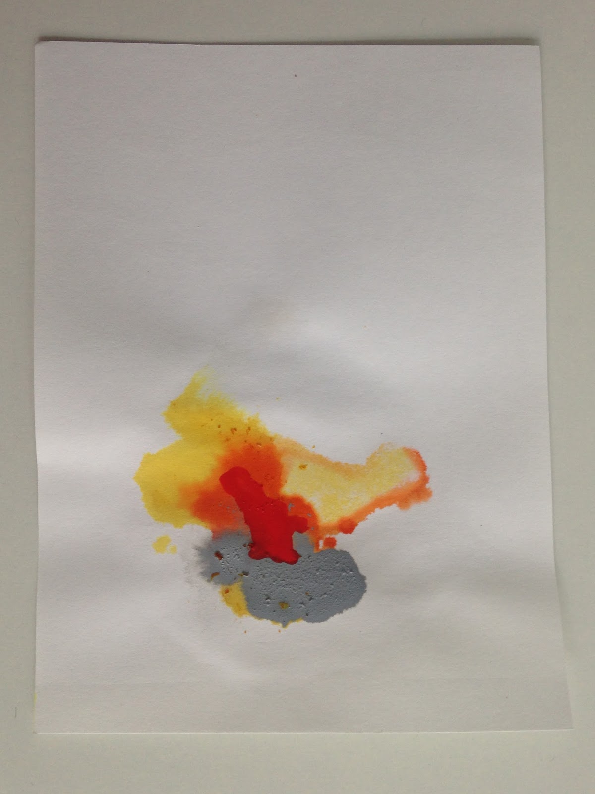
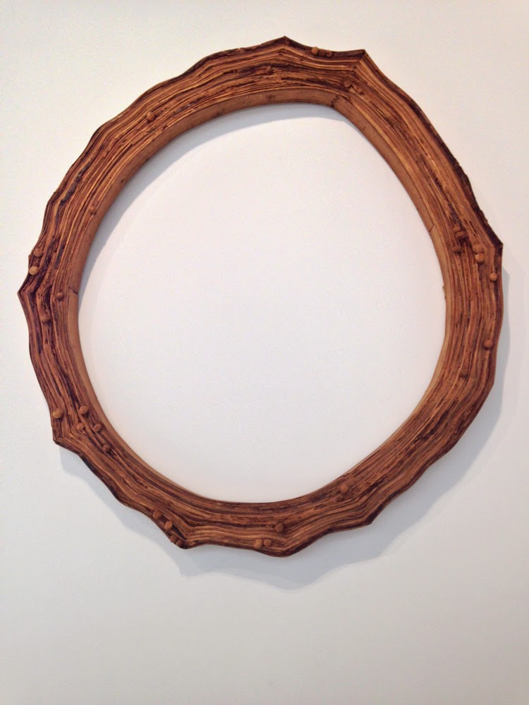
If you look for a message, or a meaning, you may be confounded. It may not even be there. Instead there are carefully rendered, sometimes beautifully detailed but abstract constructions of cellophane, topsoil, powder and paint. Previously Black has used lipstick, crushed chalk, nail varnish and body cream. In an early piece in 2000, she used Alka-Seltzer, leaving it to fizz in the rain. Sellotape and ribbon, plaster and spray paint, sugar paper and polystyrene are present too in her art. The sculptures – for that is what they are, not installations – are all named with telling words, or mysterious phrases. The titles – Motives Reached, Help Is Not Appealing, Eventually Benign – tempt you to look for meaning or a story in the sculpture, but you may get lost if you look too hard. Instead the works, which you have to see in the flesh to appreciate, have the visceral impact of the body and the natural world.
Black, who studied at Glasgow School of Art (GSA) from 1995 to 2004, is now to represent Scotland at the world’s biggest, boldest and most analysed art festival, the Venice Biennale, next year. Curated by the Fruitmarket Gallery of Edinburgh, Black’s show will fill the many rooms of the Palazzo Pisani, at the Calle delle Erbe near the Rialto Bridge, with examples of her art.
It is the 54th year of the most prestigious showcase for contemporary visual art, and the first time Scotland, in five years of having its own national show, has chosen a single female artist for its pavilion. Previous shows have featured Turner Prize winner Simon Starling and Turner Prize nominees Cathy Wilkes, Jim Lambie and Lucy Skaer, and the last time, in 2009, took the form of a solo exhibition of the work of Martin Boyce.
It is, unavoidably, a major step in Black’s career, even though she has been exhibiting widely for years. The Biennale attracts every art critic, writer, collector and gallery owner in the world to La Serenissima for a few weeks every other year. It is the culmination of years of painstaking work, and a leap on to a bigger stage. But how to describe Black’s art, so unusual and abstract, especially to someone who may not have seen it? Its meaning and sometimes its substance are as mysterious as those anonymous fingermarks, still lying moist in the south Australian caves.
When we meet for Black’s first newspaper interview, it is a frigid, windy day in Berlin. The skies hang heavy, as grey as beaten lead. Outside the Capitain Petzel gallery in the former East Berlin, leaves are being wrenched from trees on the wide boulevards. Black is represented by the Mary Mary gallery in Glasgow and the Galerie Gisela Capitain in Cologne, and this neat gallery on the Karl-Marx-Allee is also linked to the Cologne gallery. It is modern, big, functional, open-plan and clean, with large picture windows looking on to the wind-blown street, and the formidable if elegant high rises set back from the road.
We meet on the opening day of Black’s latest exhibition, an extensive display of her newest work. It is mainly, if not exclusively, divided into her large suspensions of coloured cellophane, like psychedelic hammocks, or unfolded wings, and more sturdy-looking blocks of topsoil and polystyrene, which, to this hungry writer, rather resemble slabs of cake left over from a giant’s fairy-tale wedding. Downstairs, in a somewhat clean and forbidding basement, Black has laid out a piece called Worse In Public, which comprises large slabs of turf covered with scattered powder paint and trails of plaster powder.
Elsewhere attractive works on sugar paper and balsa wood hang from the ceiling. It is a beautiful exhibition. As the winter sun sets and the electric lights make the sculptures gleam, the plastic shrouds seem liquid, the brightly coloured powder reminiscent of satellite images of the alien sands and seas of Mars or Mercury.
Black, with long brown hair and vivid blue tights, sits down in a back room of the gallery clasping a cup of tea and tries to talk me through her work. We have met before, many years ago, on the Glasgow arts and music scene, and I remember her degree show at the GSA, which was striking in its originality. She smiles often but also seems wary, especially as the conversation turns to what others have said or written about her work. She is confident, though, and has a sure grasp of what she does and the reasons she does it. She is eloquent but constantly stops and doubles back, refining what she is saying. I imagine she is rather like this when she creates her painstaking work. Basically, she says, it all comes back to those materials, and how she reacts to them. It is not quite as pure an interaction as the ancient fingers dragged through moonmilk, but it is perhaps close. It is a meticulous process, it seems, and although the results may have a looseness or a messiness, everything is exactly in the right place.
“I work with physical reality,” Black says. “I don’t start with an idea then try to make that a reality. It’s very basic. It’s about working with materials in a room. They are sculptures, they have edges. Even if sometimes they barely have edges … That’s what I am trying to do.” During our conversation she often repeats that it all begins with the materials. In a sense the works are merely the materials rearranged. Her interaction to them is both instinctive and considered. But there are limits. If she creates something that reminds her too much of the body, or bodily movements and functions, she brings into effect what she calls the “ming rule” and discards them for being “minging”. And the work, as abstract and almost formless as it may initially appear to the casual viewer, is heavily worked and reworked by Black before she is happy with it. The obsession with material began at GSA, she says, through struggle.
“I think it goes back to art school. Partly it was part of a process. And some of it came out of honesty about not being able to make anything,” she says carefully. “I remember being told a sculpture was something that stood up by itself. But making something that stands up by itself was boring. Everyone has done it before. If you want to make a plinth you can go to the workshop and someone will tell you how to make a plinth. You can learn that. Or you can bumble about and think: ‘I can’t make something that stands up by itself.’ I was always determined to find my own way, to do things I wanted to do, to enjoy myself and make my own way.”
Black says a number of times that she loves painting, although that is not the medium in which she works. Paintings, she says, can take you to another place, through the frame of the painting, but “sculpture does all that, but you can get out of this situation, this reality through an absolute physical engulfment. You can be completely overwhelmed by that, and that’s what a sculpture can do – you can be somewhere else completely.”
It is not just about the substances she works with; it is the colours too. Colours, she says, affect her on a physical level, as strongly as if there were physical objects in themselves, and can be “overpowering”.
“Ultimately I want to remove myself from the art and just say: there it is,” she says. Black later adds that when it is finished, “the art is then not for me, it is for you. Sometimes you just want to do the impossible, do things [with the materials] that are not possible. And then instead of getting really high-tech solution to that, you get messy solutions, but they are more interesting.”
In the gallery, I note the use of sods of grass as a material, a relatively new addition to her portfolio of substances. “I don’t see the difference between grass and the other substances,” she says. “The material world is the material world. I don’t see much difference between culture and nature. It’s material that’s the most important thing to me, the interaction with the material. It’s about the enjoyment of doing what I want to do. You strip away all the layers, and that’s all there really is, and people coming in and saying, ‘Oh well, that’s culture.’”
You see her art, however, and there is far more to it than Black simply indulging a personal need to play with these substances. The sculptures are often beautiful, ethereal and highly detailed: I notice the little bows of ribbon keeping the cellophane hangings together and the little shapes of soap on top of the cake-like sculptures.
“If that was all I was doing, then that would be pure self-indulgence, and that is not what I am interested in doing. But it is an instinctive process [when she is making the art]; it is almost like a stream of consciousness. It’s not like you are thinking of the audience – that’s not what’s happening. You are still an artist.”
She says in the book of her work, It’s Proof That Counts: “I am very curious about, and also absolutely detest, the idea of the artist as an instructor or teacher of others. The idea is very old but still prevalent in society today.
“It enrages a lot of people, because it is obviously ridiculous, but also it is felt that artists are not living up to it, the complaints being that there is no meaning to be found in their work, or it is not considered skilled enough in its making.”
Black adds: “It is the individual that I believe in, as always having the potential to be in control of their own destiny, learning and desires. I believe in art itself as transformative, as aspirational, as a philosophical, healing, improving thing, but definitely not as the artist as elevated in any way.”
Black is in demand. Besides representing Scotland in Venice, next month a room of her work, called Pleaser, will be installed at the Scottish National Gallery of Modern Art in Edinburgh. Her work is in the British Art Show, a comprehensive survey of new and contemporary art, in London, Nottingham and Glasgow, this year and next, and she has forthcoming shows in Los Angeles, Italy and Yorkshire and at Tate Britain. In a year that has seen the Glasgow artist Susan Philipsz win the Turner Prize with her audio piece of the Scottish traditional ballad Lowlands, it is easy to imagine Black’s work being in the frame for the big prize in the near future.
Simon Groom, the director of modern and contemporary art at the National Galleries of Scotland, is a fan.
“We like her,” he says. “We like her so much we have bought work by her, a work called Contact Isn’t Lost, and we have a room of her work soon to be on display at the galleries. People who do not know her work will be able to have a taster. Her work is so interesting – it is extending a tradition of the use of materials. But there is something almost indescribable about it. Sometimes it can look like the wings of angels, at other times bits of paper. There is something lyrical and beautiful on one hand, and something quite clunking on the other. It’s a wonderful mix of sensibility and sensuality.”
Fiona Bradley, director of the Fruitmarket Gallery in Edinburgh, says the choice of Black for Venice was, in the end, a simple one.
“She makes good art,” Bradley says. “They are not installations – they are sculptures, they are objects and not environments. They are very much about time. It’s about the here and now and what she does with the material. She is not recreating anything.”
Bradley though is quick to add that Black is not “representing” Scotland. “I think it is quite important that we haven’t asked Karla to represent Scotland,” she says. “We have asked Karla to make the work in this context, which happens to be Scotland in Venice.”
Black herself says she cannot consider her art as representing Scotland. “I can’t think of that,” she says. “I don’t think about it. This is what I do, and I do it all the time, and I don’t think about it. It’s not fair, it’s a bit weird. I make shows all the time, and so I am just thinking of the show. I am doing what I do, and I happen to be Scottish and I happen to live in Scotland.”
Katie Nicoll, the producer of Scotland And Venice, will start the process of filling the Palazzo Pisani with Black’s work in May, to open in the first week of June.
“She is very excited about the space and when you see the scale of her work, you can tell she really tackles it,” says Nicoll. “With her art, I see both the scale of the pieces and the detail. As I work with her, both those things become more evident. The more time you spend with it, the more detail you see, and I love that.”
Because of the predominant colours in Black’s palette – pinks and light blues – and the use of make-up and similar substances in previous works, her art has been described as feminine or some kind of comment on femininity. The artist knows this and is very careful answering questions about it. You can tell she is not entirely comfortable dealing with the subject.
“It’s not an issue for me – it is an issue that comes from outside of me. It’s a cultural judgment from outside.” She thinks and adds: “It’s like when you are young, you don’t know you’re a girl until someone tells you. I am just thinking about the material. I am not naive – I do know that certain things remind people of things – but it is only women’s work that is judged on gender.”
The opening night of Black’s exhibition in Berlin attracts many artists from the city. German art aficionados clad in black peer at the works, move on and return to have another look. It’s evident her works repay repeated viewing. Wine glasses clink and people wander around the sculptures, looking and staring. Everyone seems impressed. Karla Black has worked very hard over a number of years on her singular vision, and next year the whole art world will see it. She says she has not yet found everything she is looking for. “I want to know everything about my work, and what I am doing,” she says, “so I can understand it.”
Karla Black’s work at the Scotland And Venice exhibition is on show at the Venice Biennale from June 4-November 27, 2011. Visit www.scotlandandvenice.com.